Dashboard overview
A tour of the CorriDraw dashboard at /diagrams — the dark sidebar, the sticker-note header, the workspace tree, and how to start a new diagram.
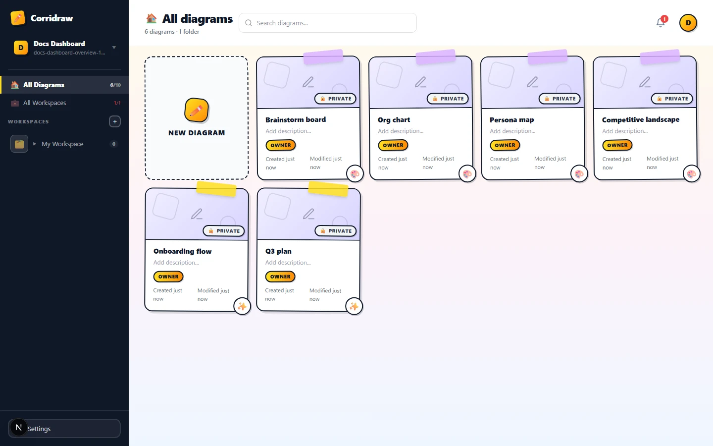
The dashboard is where you land the moment you sign in. It is a single screen at /diagrams that shows everything you can draw on, organised by workspace and folder, with a search bar and an avatar menu sitting in the header. Everything here is click-driven (or tap-driven on a tablet) — there is no editor toolbar to memorise. This page walks through every region of that screen, so you know exactly what you are looking at and where to click first.
What you see at /diagrams
The dashboard splits into three columns of activity stacked on top of each other. From left to right: a dark vertical sidebar that owns navigation; a tall main area with a white header, an optional invitations strip, and a grid of diagram cards; and a thin gradient backdrop that bleeds into the page. There is no separate footer chrome — the page scrolls cleanly to the last folder.
You arrive here automatically after sign-in, after creating an account, and any time you click the Corridraw logo while you are inside a diagram. The URL stays at /diagrams until you open a workspace, a folder, or a single drawing.
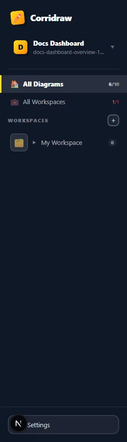
The dark sidebar
The sidebar is fixed at 260px wide on desktop and slides out from the left on mobile (tap the menu icon in the header to reveal it). It is the navigation spine of the entire app and stays put while you browse. From top to bottom it shows:
- The Corridraw logo — a pencil sticker plus the wordmark. Click it to open the marketing site in a new tab so you do not lose your dashboard state.
- Your user card — avatar bubble, display name, and email. Click it to open the account menu with Settings and Sign out.
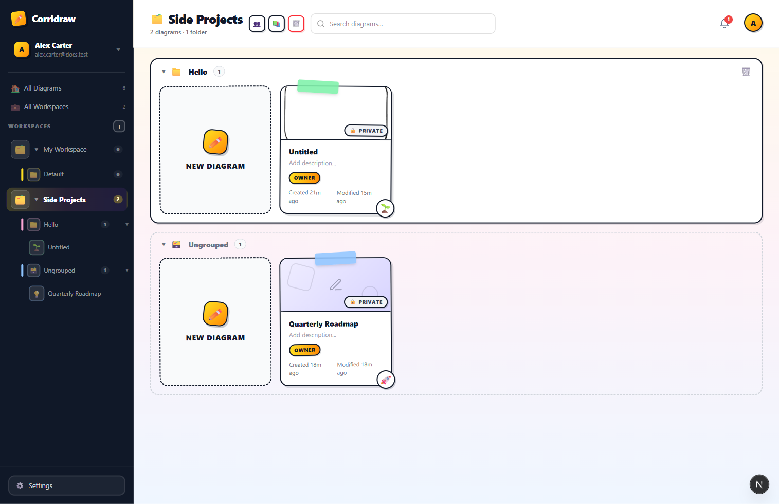
- Two top-level entries: All Diagrams (every drawing you can access, regardless of workspace) and All Workspaces (a card grid of the workspaces themselves). Click either to switch the main grid to that scope.
- The workspace tree — every workspace you belong to, expandable into folders and diagrams. Click a workspace name to open it, click the chevron to expand or collapse it. Drag-and-drop is alive here too: drag a diagram from the main grid onto a folder name in the tree to move it.
- A Settings shortcut at the bottom edge.
The header bar
The header runs across the top of the main area and adapts to whatever you are looking at. The title icon switches between four states so the page label is never ambiguous:
- House when you are looking at All diagrams.
- Briefcase when you are on All workspaces.
- Folder tabs when a single workspace is open.
- Folder when you have drilled into one folder inside that workspace.
Below the title, a small subtitle counts the diagrams (and folders) currently in view, so you always know the size of the slice you are looking at. To the right of the title sits the search bar (or a search icon on mobile that expands inline when tapped), the announcement bell, and your avatar bubble. The only context-specific button is + Workspace, which appears in the header when the All Workspaces view is active — click it to create a workspace without scrolling.

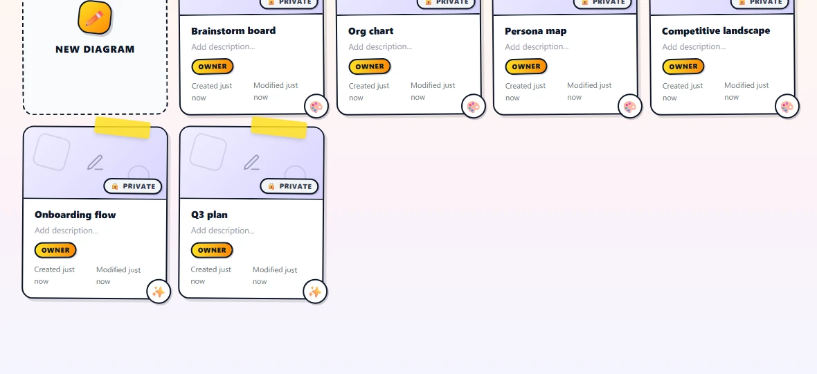
The main grid
The body of the page is a responsive grid of cards. The grid auto-fills columns at 200px minimum width per card, so it reflows down to one column on narrow screens and up to six or more on a wide monitor. Each grouping you see is a folder block: a labelled wrapper with its own drag-drop target around a row of diagram cards. Diagrams that are not in any folder collect at the bottom inside an Ungrouped block with a dashed border.
The very first card in the grid is always the New diagram card — a dashed plus-sign tile that creates a fresh drawing in whatever scope you are viewing. Click (or tap) it and you land in the editor at /editor/<new-id> with an empty canvas.
Creating a new diagram from here
You have three ways to start a drawing without leaving the dashboard, and they all land you in the editor on a blank canvas:
- Click the New diagram card in whatever view you are on. The drawing is created in your current scope — workspace and folder — so it shows up in the same block you are looking at.
- Open a folder first, then click New diagram. The drawing inherits that folder so you do not have to move it afterwards.
- Click All Diagrams in the sidebar, then click New diagram there. The drawing lands ungrouped and you can drag it into a workspace or folder later.
Customising a diagram card
Hover any diagram card you own and a small action row appears in the top-right corner — version history (🕒), delete (🗑️), and edit details (✏️). Clicking the pencil opens a slide-out panel from the right edge with everything you can change about the card: name, description, the corner icon, the cover background, a built-in template thumbnail, or a custom uploaded image.
The Icon section is a row of twelve curated emoji plus an Auto button. The auto choice falls back to a per-card doodle picked deterministically from the diagram's id, so an unconfigured card still shows something distinctive. Pick any emoji to override that default — handy for marking a card as shipping with 🚀, bug repro with 🐛, metrics with 📊, or any other shorthand your team uses. Your choice persists per-diagram on the server, so it travels with you across browsers and devices.
Pending invitations strip
If somebody has invited you to a workspace, a yellow strip slides in just under the header with one row per pending invitation. Each row carries the workspace name, who invited you, and an Accept button. Click Accept and the workspace drops into your sidebar tree immediately — no page refresh needed. The strip disappears once you have accepted or declined every pending invite.