Charts
Drop a CSV onto the canvas and CorriDraw renders a live chart you can resize, restyle, and export with the rest of your diagram. Fourteen chart types — including stacked / horizontal / step variants — per-series colours, dual Y-axes, and the data lives inside the diagram so it survives save / reload / copy-paste.
The chart tool turns a spreadsheet into a live chart on the canvas — drag the chart icon out of the toolbar, drop a .csv file onto the empty card, and the data shows up as a themed chart you can switch between fourteen styles (line, three flavours of bar, three flavours of area, pie, scatter, composed, radar, radial, treemap, funnel) from the side panel. Unlike a pasted screenshot, the chart re-renders against the rows on every type swap, theme switch, or resize. The CSV itself is stored inside the diagram, so the chart travels with the file through save / reload / copy-paste / undo / PNG export.
Pick the chart tool
Click the Chart icon on the top toolbar — it sits between the image and frame buttons and looks like a small bar chart with a baseline. With the tool active, drag on the canvas the same way you'd draw a rectangle: click where you want the top-left corner, drag down-right, release. CorriDraw drops a chart card sized to your drag, with a hand-drawn dashed border and a centred Drop a CSV file / or click to upload message. On a tablet, the chart icon lives in the bottom toolbar.
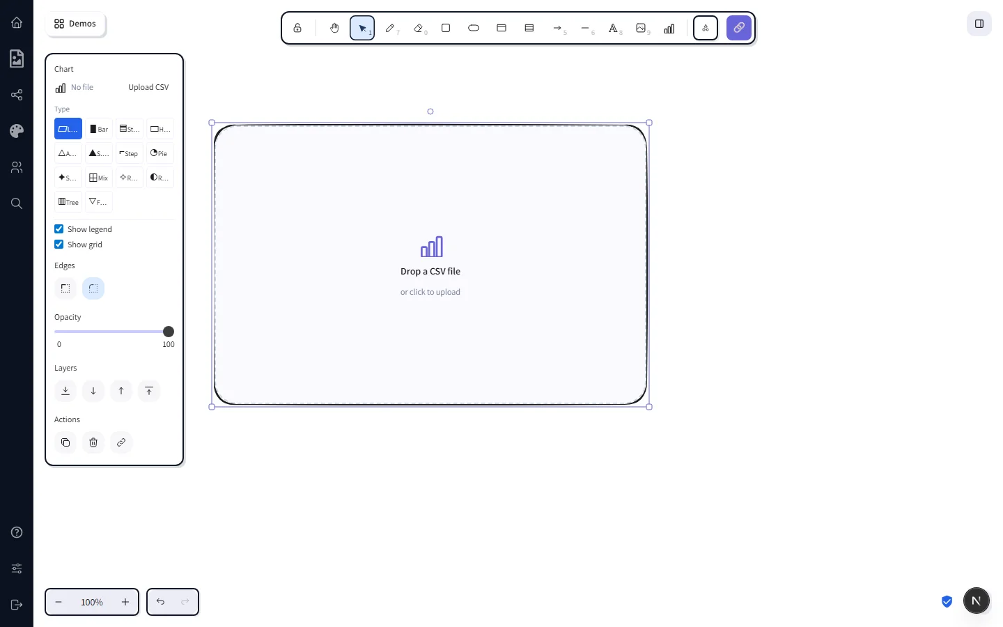
Drop a CSV
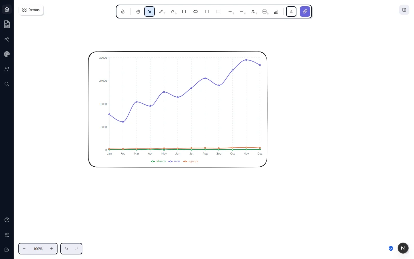
Drag any .csv file from your computer onto the empty card and release — the file is parsed in-place and the chart appears as a line chart by default. If you'd rather pick a file with a chooser dialog, click the card while the chart is selected and the system file picker opens to .csv. Either path uses the same in-browser parser; nothing is uploaded to a server.
The first row of the file is treated as a header row. CorriDraw inspects the columns and:
- Picks the first non-numeric column as the X axis (typical:
month,region,name). - Treats every numeric column as a Y series (typical:
sales,refunds,signups). - Falls back to the first column overall if every column parses as numeric (i.e. there is nothing categorical to put on the X axis).
Both choices are overridable from the side panel — see Configure from the side panel below.
The fourteen chart types
With the chart selected, the side panel shows a 4×4 grid of type tiles (one per chartType slug — bar variants grouped together, area variants grouped together). Click any tile to re-render the same data in that style. Pick by what you want the reader to take away:
- Line — trend over time. Best when X is ordered (months, days, sequence numbers) and you care about the shape of the change.
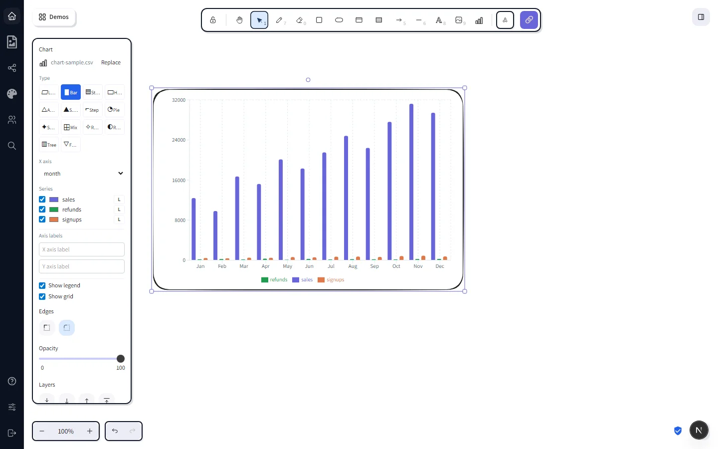
- Bar — grouped bars per category. Multi-series bars sit side-by-side, so this works well when you want the reader to compare each X tick across series at a glance.
- Stacked bar — same data, but each series stacks on top of the previous one. Reach for this when the per-bar total matters more than the individual series — e.g. revenue split by acquisition channel where you also want to read off total revenue per quarter.
- Horizontal bar — bars run left-to-right with categories on the Y axis. Use it when category names are long (regions, product names, survey responses) — labels read naturally instead of being rotated 90°. Right-axis pinning is disabled for this variant since there's only the one numeric scale.
- Area — overlay-style filled lines. Same shape as line, but emphasises volume. Useful when the absolute values matter (cumulative cost, total throughput).
- Stacked area — layered series that add up to a total. Reads well when each layer is a meaningful component of the whole and the trend of the sum is part of the story (web traffic by source, product revenue by SKU).
- Step area — discrete jumps instead of smoothed curves, with a filled area under the line. Right for series that change at known boundaries — pricing tier changes, headcount snapshots, version-bumped metrics — where a smoothed line would imply continuous transitions that aren't real.
- Pie — slice proportions of a whole. Pie uses only the first Y series and groups by X — keep it for "what fraction of the total" stories with a small number of slices.
- Scatter — XY plot. Each row becomes a dot. If your X column is numeric, you get a classic scatter (e.g. height vs weight); if X is categorical, you get a dot plot with one dot per category per series.
- Composed ("Mix" tile) — bars and lines on the same chart. By default the first series renders as bars and the rest as lines. Combine with the L/R axis toggle to put each scale on its own side.
- Radar — values plotted around a circular axis. Good for comparing a small number of profiles across the same set of metrics (e.g. three products on five attributes).
- Radial — concentric arcs sized by a single Y series. A space-efficient alternative to a horizontal bar chart, especially for KPI dashboards.
- Treemap — nested rectangles sized by the first Y series. Great when you want to show the relative scale of many items in a small area; outliers stand out instantly.
- Funnel — stacked trapezoids that narrow toward the bottom. Conversion-style stories: signup → activated → invited a teammate → paid.
Tile labels are abbreviated (Stack for Stacked bar, Horiz. for Horizontal bar, S.area for Stacked area, Mix for Composed) so all fourteen fit four-per-row in the side panel — hover any tile for the full descriptive name.
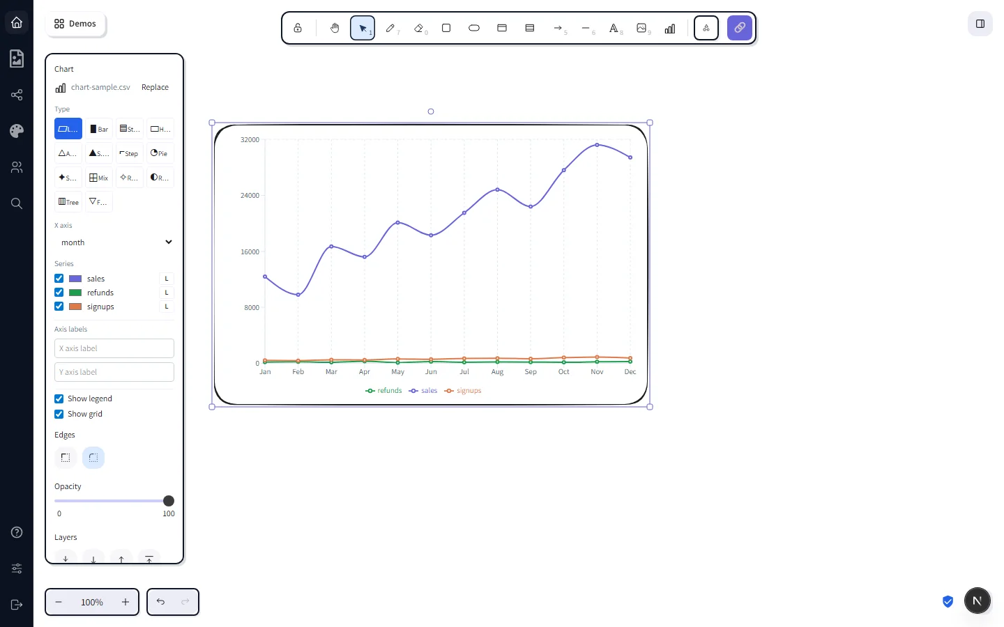
Configure from the side panel
Below the type grid, the side panel exposes the rest of the chart's settings. Each control writes back to the chart's stored data immediately — there's no Apply button.
- Replace CSV — swap in a new file without redrawing the chart. The current type, axis assignments, and per-series colours are kept where the column names line up.
- X axis — dropdown of column headers from the CSV. Pick whichever column you want on the horizontal axis; CorriDraw refits the rest.
- Series — every numeric column from the CSV gets a checkbox. Untick a series and that line / bar / area / radar disappears immediately. Beside each checkbox is a colour swatch — click it to override the default palette colour for that series.
- Axis side (L / R) — for line / bar / area / composed charts, the small
L/Rbutton next to each series pins it to either the left or right Y axis. Turn this on the moment one series is in the thousands and another is under a hundred — Recharts' shared scale will otherwise flatten the smaller one to a flat line. - Axis labels — text inputs for the X and Y axis titles. Showing up as italic labels along each axis. Empty inputs hide the labels.
- Show legend / Show grid — checkboxes that toggle the legend chips at the bottom and the dotted gridlines.
The chart lives in the diagram
The CSV bytes are stored inline on the chart element, alongside the type, axis assignment, colours, and toggles. Practically that means:
- Save the diagram and reopen it later — chart still there with the same data and configuration.
- Copy a chart with
Ctrl+Cand paste it into a different scene — the duplicate has the same CSV, no re-import. Ctrl+Zundoes type swaps, axis changes, and series toggles, the same as any other element edit.- PNG export rasterises the live Recharts SVG onto the export canvas, so the chart appears in the exported image alongside everything else on the diagram.
Because the CSV travels with the diagram, your collaborators don't need access to your spreadsheet to see the chart — they get the data the moment they open the file.
Heads-ups
- The CSV needs a header row. The first row is parsed as column names; if you skip it the chart's series labels show up as the values from row 1.
- Pie / radial / treemap / funnel are single-series. They use only the first numeric column. Switch to bar or line if you want every column on screen at once.
- Stacking only makes sense with comparable units. Stacked bar / area charts add the series values together at every X tick — only do this when the sum is meaningful (revenue split by channel, time spent across activities). Don't stack unrelated metrics like revenue and headcount.
- Horizontal bar drops the right-axis toggle. The variant uses a single numeric scale, so the per-series
L/Rbutton is hidden in the side panel. Use grouped vertical bar instead if you need dual axes. - Off-screen charts in PNG export. If a chart is virtualised off the canvas at export time, the export pipeline draws a placeholder rectangle for it instead of the live chart. Scroll so the chart is visible before exporting if you need it in the output.
- Mixed scales. If two series have wildly different magnitudes (e.g. revenue in thousands and refunds in single digits), use the
L/Rtoggle to split them onto separate Y axes — otherwise the smaller series flatlines visually. - Hover tooltips are off in editor mode. The chart container is click-through once a CSV is loaded, so the canvas can handle selection / drag / resize like every other element. Recharts' built-in hover tooltips only show on the rendered PNG export and on read-only views.
See it in motion
Watch a 13-second walkthrough of the full flow on the features page — toolbar pickup, CSV drop, type swaps, side-panel tweaks. The same demo data (chart-sample.csv) is what appears in every figure on this page.