Text & labels
Add text in CorriDraw as a standalone element or as a label bound to a shape. Configure font, size, alignment, and auto-resize behaviour.
Text in CorriDraw lives in two flavours: standalone text elements that float anywhere on the canvas, and bound labels that live inside a shape and reflow with it. The same tool produces both — what changes is whether you click on empty canvas or on an existing shape. This page walks through both modes plus the styling controls that apply to all text.
Pick the text tool
Click the Text button on the top toolbar — it's the icon with a capital "A" sitting between the shape tools and the freehand draw tool. A single click activates the tool; the cursor changes to a text caret. On a phone or tablet, the same icon lives in the bottom toolbar — tap it to switch to the text tool.
Once active, click anywhere on empty canvas to start typing, or click on an existing shape to drop a label inside it.
Standalone text
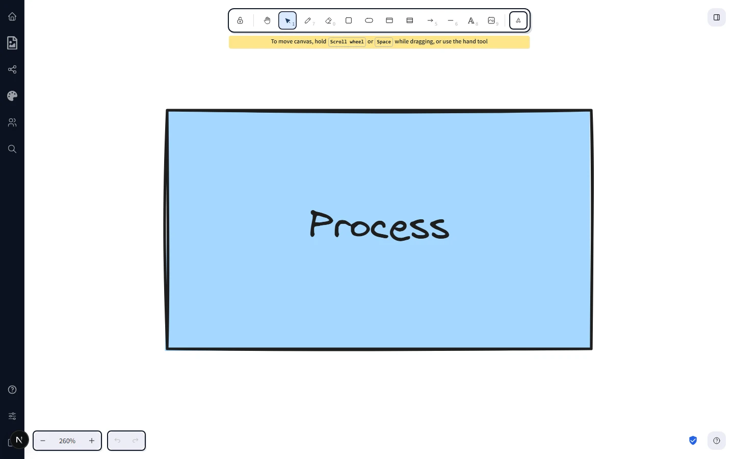
Click on empty canvas with the text tool. A caret appears and you can type. The text element grows automatically as you type — width adapts to the longest line, height adapts to the number of lines. Press Enter on a new line to break, click outside the text (or press Esc) to commit.
Standalone text is a normal element. Move it, resize it, change its colour, group it with shapes — it behaves like any other object on the canvas.
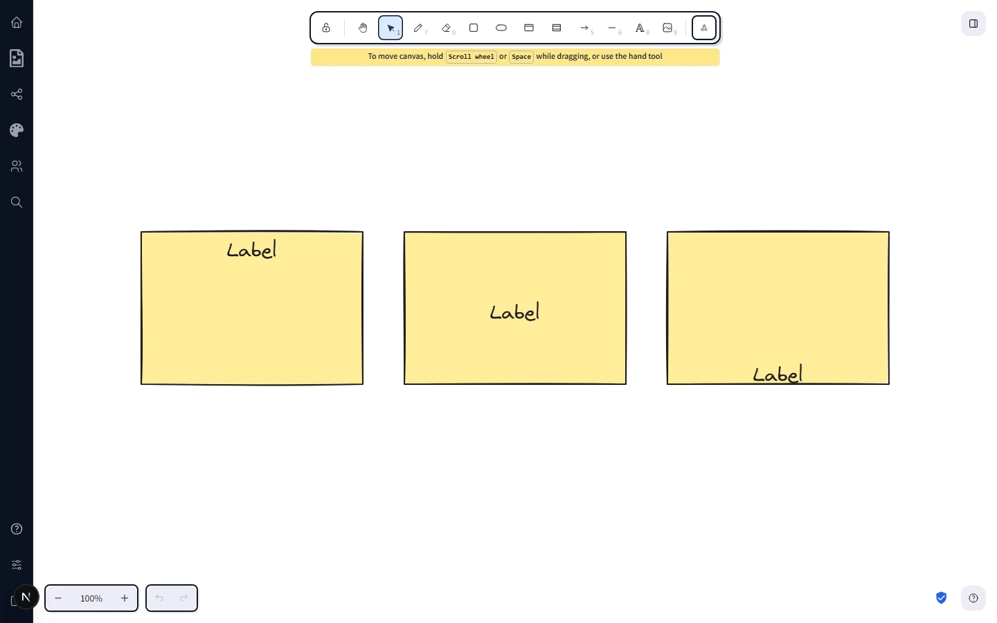
Text bound to a container
Most shapes — rectangles, diamonds, ellipses, hexagons, triangles, parallelograms, trapezoids, pentagons, octagons — are text containers. With the selection tool active, double-click any of them and a caret appears inside the shape. Type to fill it. The text now belongs to the shape: it moves when the shape moves, resizes when the shape resizes, and stays centred inside the shape's bounds. On touch devices, double-tap the shape to enter text-edit mode the same way.
Auto-resize
By default, bound text wraps to the width of its container and stretches the container vertically if the text grows beyond what fits. To flip this behaviour, select the shape and look in the right-hand properties panel for the Enable text auto-resizing toggle — switch it on and the container will grow horizontally as you type instead, keeping the text on a single line.
Auto-resize is per-element. Use it for short labels and chip-like shapes; leave it off for paragraph-style content where you want the text to wrap inside a fixed-width box.
Vertical alignment
Bound text sits in one of three vertical positions: top, middle (the default), or bottom of the container. With the shape selected, find the Text align row in the right-hand properties panel — it shows three icon buttons for top, middle, and bottom. Click one to apply. The same row also offers horizontal alignment (left, centre, right). Standalone text only shows horizontal alignment because there's no container to align it within.
Font size
The Font size row in the properties panel offers four preset buttons — Small, Medium, Large, Very large. The default is Medium (20px). Click the size you want and the selected text updates immediately.
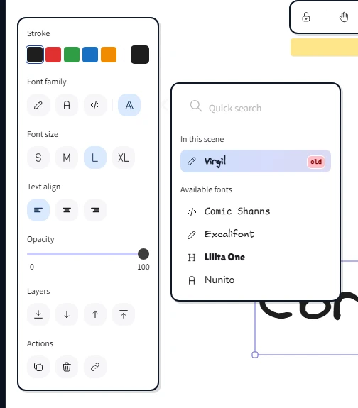
Fonts
CorriDraw ships several font families covering different moods:
- Excalifont — the friendly hand-drawn default. Best for sketches, whiteboards, casual diagrams.
- Nunito — clean rounded sans-serif. Good for slides and presentations.
- Lilita One — chunky display face for headings and posters.
- Comic Shanns — monospaced, hand-drawn — the typewriter of the comic book world.
- Liberation Sans — neutral sans-serif for technical documents.
- Cascadia — monospace for code, terminal output, and tabular data.
- Helvetica and Virgil are also available for legacy compatibility.
To pick a family, select the text and click the Font family button in the properties panel — the picker pops out as a panel showing every available family, with each option rendered in its own face so you can preview before committing. Hover (or tap-and-hold on touch) to see the selected text reflow live, then click to lock in your choice. Every text element on the canvas can use a different font, including bound labels inside the same diagram.
Horizontal alignment
The horizontal alignment buttons offer Left, Centre, and Right. Bound text inside a shape defaults to centre alignment because that's what flowcharts and architecture diagrams want. Standalone text defaults to left alignment, the same as a paragraph in a document. Click any of the three icons in the Text align row to switch.
Unbinding and rebinding
Selected a bound label and want to detach it? Right-click the label (or open the actions menu next to the properties panel) and pick Unbind text — the label keeps its current position but no longer follows the shape. The reverse action, Bind text to the container, takes a standalone text element overlapping a shape and binds them together. Wrap text in a container wraps a piece of standalone text in a fresh rectangle in one click.
Editing existing text
Double-click any text — bound or standalone — to enter edit mode. The caret lands at the click position. Click outside (or press Esc) to commit your changes. The Undo button in the top toolbar reverts character-level edits, so you can experiment freely without fear of losing your previous version.