Font & text style
Pick from five font families, four size presets, and configure horizontal and vertical alignment for any text in CorriDraw.
Text in CorriDraw lives in two places: as standalone text elements you drop on the canvas, and as labels bound to shapes (the text that flows inside a rectangle, diamond, or other container). Both share the same styling controls — a font family picker, four size presets, a horizontal alignment row, and, for container-bound labels, a vertical alignment row. All of them live in the right-hand properties panel.
Find the controls
Click a text element or a shape that contains text. The right-hand properties panel reveals a Font family row, a Font size row, and a Text align row. If the selected element is a label inside a container, a Vertical align row appears below text-align as well. On phones and tablets the same rows appear inside the side panel that slides out from the hamburger button at the top of the screen.
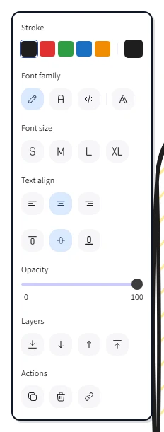
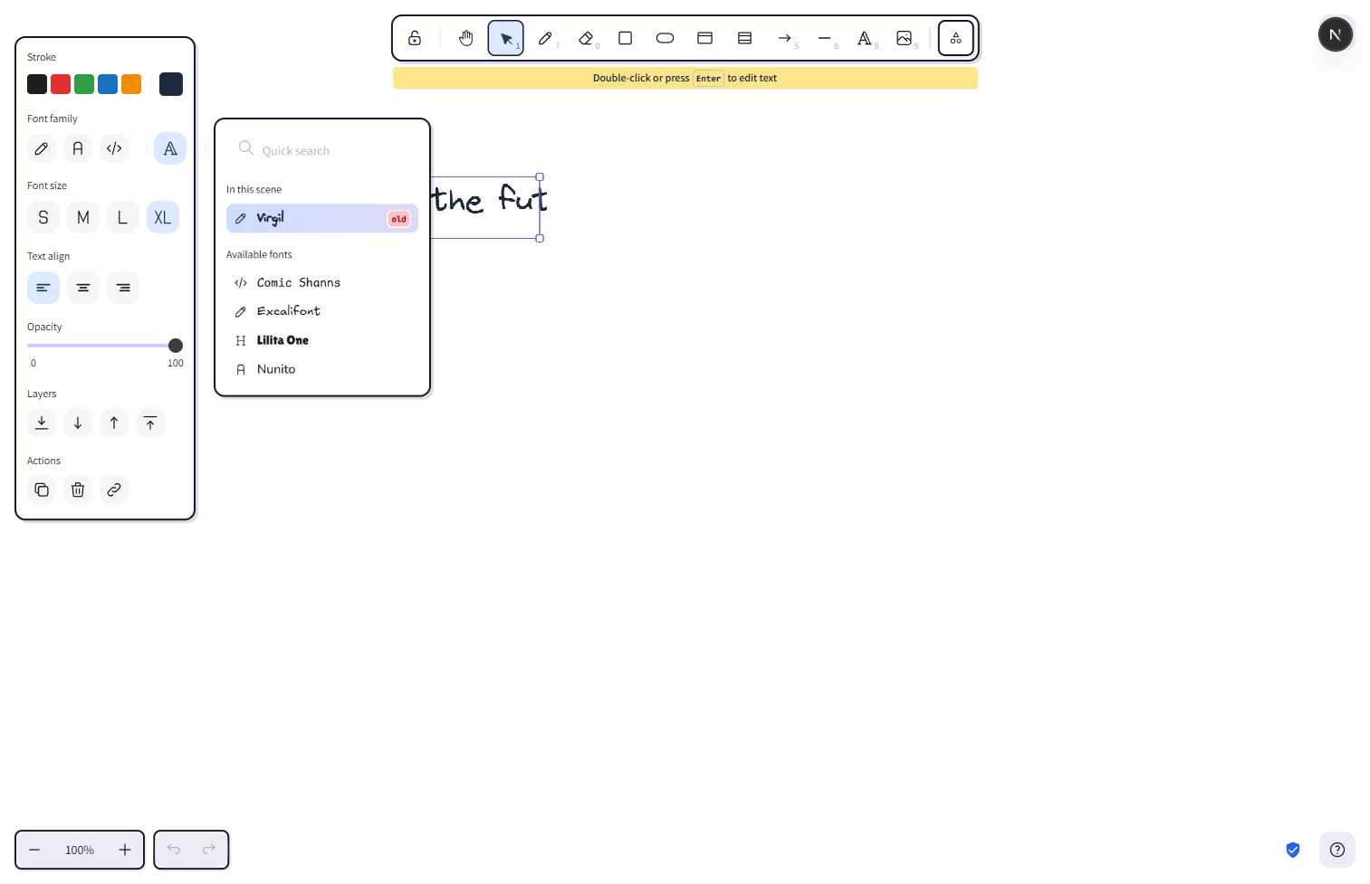
Font family
The Font family row shows three quick-pick buttons for the most-used faces, plus a "more" button that opens the full picker:
- Hand-drawn (Excalifont) — the default. A casual, sketchbook face that matches the hand-drawn aesthetic of the rest of CorriDraw.
- Normal (Nunito) — a clean, rounded sans-serif. Use it when text needs to read clearly at small sizes or when the diagram is going into a formal document.
- Code (Comic Shanns) — a friendly monospace face. Perfect for code snippets, terminal output, and any text where character alignment matters.
Click the "more" button to open the popover and see the rest — Lilita One for chunky display headers and Liberation Sans as a system-style fallback. Hover any option (or tap-and-hold on touch) to preview the selected text reflowing live before you commit.
Font size
The Font size row shows four preset buttons, each labelled with its visual weight:
- Small — 16px. For annotations, footnotes, or dense diagrams.
- Medium — 20px. The default size, balanced for body labels in flowcharts.
- Large — 28px. Section headings or shape labels that need to dominate.
- Very large — 36px. Title text, banners, or callouts.
Click the size you want and the selected text updates immediately. Sizes outside the four presets (set by stepping with the keyboard, see the pro tip below) are saved on the element exactly so you can come back to them later.
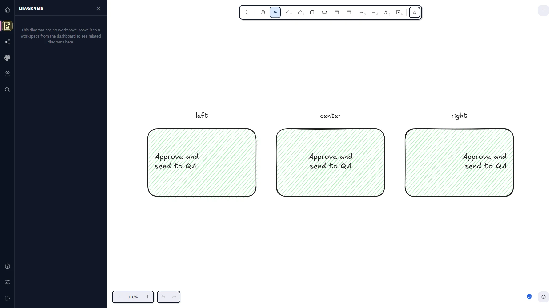
Horizontal alignment
The Text align row offers three buttons — Left, Center, and Right. For standalone text elements, the alignment controls where each line sits within the text element's own bounding box. For text bound to a shape, it controls where each line sits inside the shape — useful when, say, a long label should hug the left edge of a wide rectangle instead of centering inside it. Click an icon to apply.
Vertical alignment (container labels)
Container-bound labels add a fourth row, Vertical align, with three buttons — Top, Middle, and Bottom. Click one to decide where the label sits along the height of its container. Middle is the default and works for most flowchart boxes; top is useful when a process box has a header label and a body label, with the header pinned up; bottom is useful for caption-style labels under a content area.
Mixed selections
If you select multiple text elements with different fonts or sizes, the corresponding row shows no highlighted button. Pick a font or a size and CorriDraw applies it to every selected element at once. The same applies to alignment: a left-aligned and a right-aligned element selected together show no active button until you commit a value.
Defaults for new text
When no element is selected, changing the font, size, or alignment in the panel updates the defaults instead. The next text you type or shape label you add picks up those values automatically, and CorriDraw remembers them between sessions.