Anatomy of the editor
A complete reference for every region of the CorriDraw editor: the activity bar, top toolbar, title bar, properties panel, main menu, zoom controls, and the help shield. Every label, every shortcut.
The editor is built around an infinite canvas. Every other piece of UI is chrome that floats over the canvas, anchored to one of six regions: the left activity bar (a vertical strip of panel toggles, VS Code-style), the shape toolbar that runs along the left edge of the canvas, the diagram title pill at the top of the Diagrams panel, the right-side properties panel, the bottom-left zoom and history cluster, and the bottom-right status shield. This page walks through each region in the order you'll most often touch them — what each icon looks like, what it does when you click it, and the keyboard shortcut that does the same thing once you've memorised the layout. Bookmark it; every other chapter in the manual references back here.
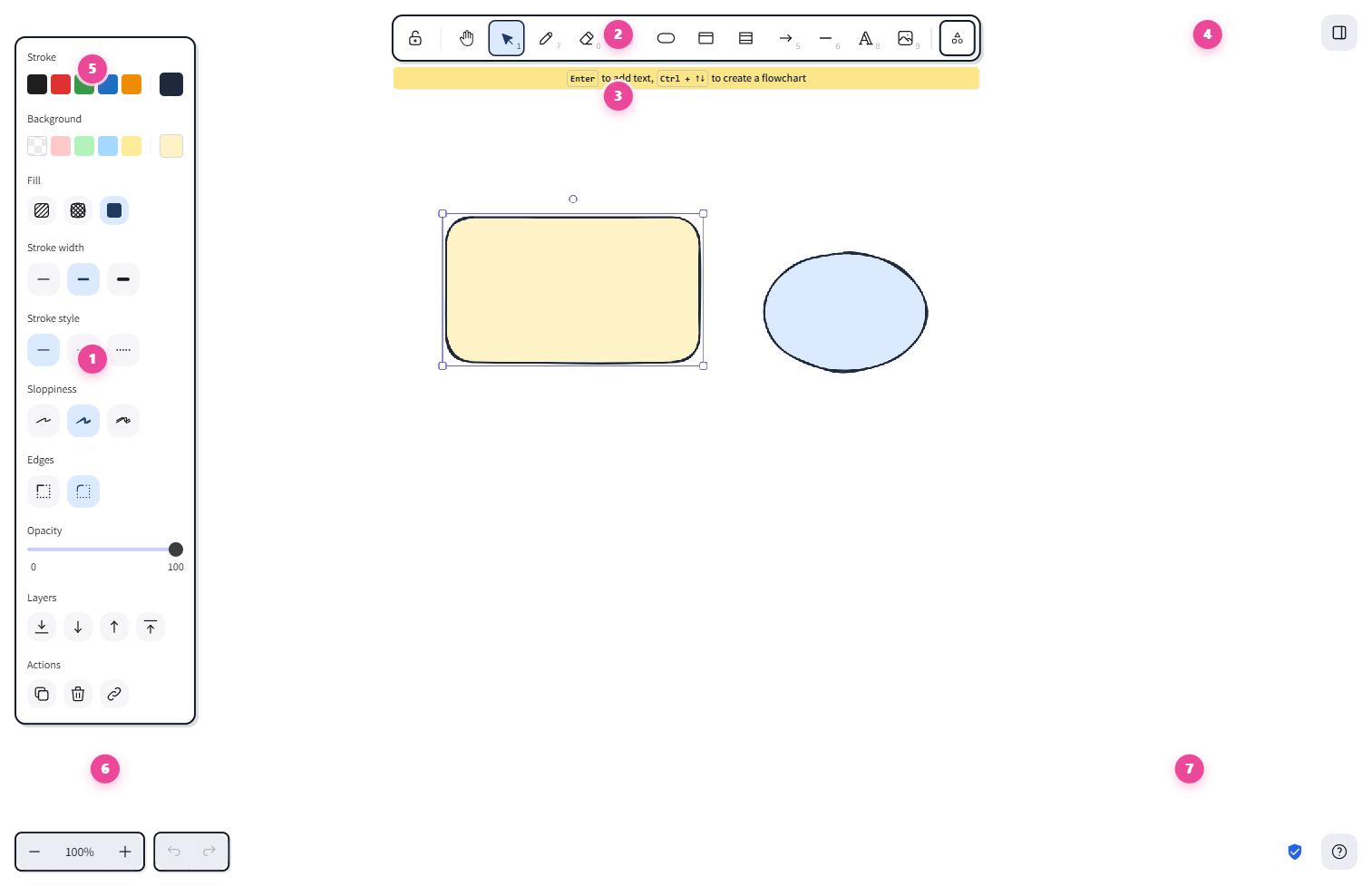
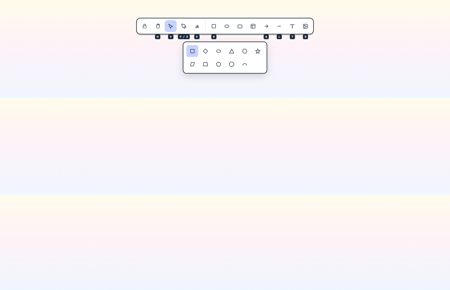
1. The shape toolbar
The shape toolbar runs vertically along the left edge of the canvas, just inside the activity bar. It holds every drawing tool. Click any icon to arm it; the icon highlights to show it's active, and your cursor changes to match. From top to bottom:
- Hand — pan the canvas without selecting anything. Shortcut
H. - Selection — the default arrow cursor for picking things up. Shortcut
Vor1. - Draw — freehand pen for sketches and signatures. Shortcut
P,X, or7. - Eraser — drag across anything to delete it. Shortcut
Eor0. - Shapes group — clicking opens a flyout with rectangle, diamond, ellipse,
triangle, hexagon, star, and the rest of the geometry pack. Shortcuts inside the flyout:
rectangle
R/2, diamondD/3, ellipseO/4. Right-click the group to open Shape Packs and toggle which collections appear. - Arrow — connector with a head. Shortcut
Aor5. - Line — connector with no head. Shortcut
Lor6. - Text — drop free-floating labels anywhere. Shortcut
Tor8. - Insert image — opens a file picker for PNG, JPG, SVG, WebP. Shortcut
9.
Two tools live off the toolbar but are still one click (or shortcut) away: the
laser pointer (a fading cursor for collab annotations, shortcut
K) and the frame tool (rectangular grouping, shortcut
F). The padlock icon at the bottom of the toolbar toggles Keep selected
tool active after drawing — click it to keep your current tool armed across multiple
shapes (shortcut Q).
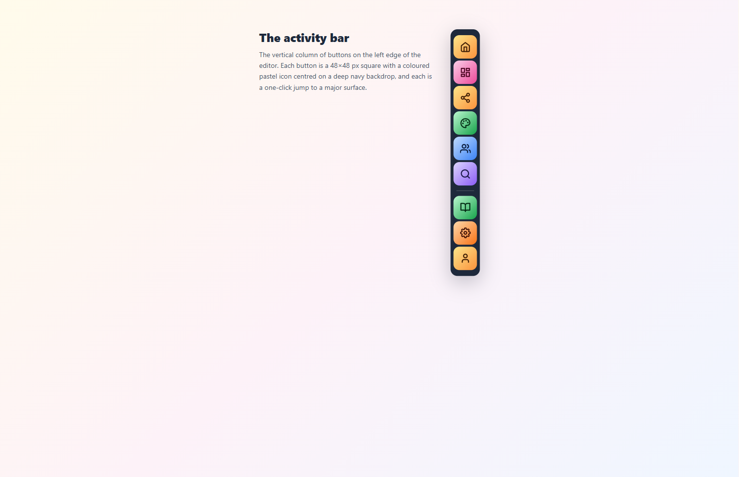
2. The left activity bar
A vertical, dark strip of icons pinned to the left edge — modelled on VS Code. The home icon plus five panel icons sit up top, and three more icons live at the bottom. Click a panel icon to slide its panel out next to the activity bar; click the same icon again (or click outside the panel) to close it. The right edge of the panel has a drag-to-resize handle. Hover any icon for a tooltip showing its name and shortcut.
Top group, in order from the top:
- Dashboard — the home icon at the top is a click-action: returns you straight to the workspace dashboard. No panel.
- Diagrams — list of every diagram in your workspace. Click a row to
switch. The currently open diagram's title pill sits at the top of this panel — click it
to rename inline. Shortcut
Ctrl+Shift+D. - Share — rename, share-with-people (live-collab + read-only public
links), version history, comments, and export & backup. Shortcut
Ctrl+Shift+S. - Canvas — background color, grid, snap-to-objects, zen mode, view-only
toggle. Shortcut
Ctrl+Shift+K. - Collaboration — current participants, follow mode, presence cursors.
Shortcut
Ctrl+Shift+L. - Find — search for text inside the canvas and on frame names. Shortcut
Ctrl+Shift+F.
Bottom group, in order from the top:
- Tutorial & docs — opens the in-app tutorial and links out to this documentation site. Click-action, no panel.
- Settings — preferences, shortcuts editor, appearance. Shortcut
Ctrl+,. - Account / Sign in — when signed in, the avatar circle at the very bottom shows your initial; click it to manage your account or sign out. When signed out, the icon flips to Sign in.
3. The title pill
The diagram name lives in a yellow pill at the top of the Diagrams panel — open
the panel from the activity bar (or with Ctrl+Shift+D) to see it. A new
diagram starts as Untitled. Click the pill once and the text becomes an editable
field — type a new name, then click anywhere off the field to commit (or press
Enter). The new name shows on the dashboard and on every share link's
preview.
Autosave runs continuously in the background; you can also confirm sync state from the Share panel's Version history entry, which records every save the server accepted.
4. File-level commands (split across panels)
There's no single "main menu" hamburger in the current build — the activity bar replaces it. The file-level commands you'd expect from a desktop app are split across panels and keyboard shortcuts:
- Open a
.corridrawor.excalidrawfile — keyboard shortcutCtrl+O/⌘+O, or use the Open action from the welcome screen on a fresh canvas. - Save to disk —
Ctrl+S/⌘+Sdownloads the current scene as.corridraw. Also reachable from the Share panel's Export & backup entry. - Export image… —
Ctrl+Shift+E/⌘+Shift+Eopens the PNG / SVG / clipboard exporter. Also under Export & backup. - Live collaboration… — open the Share panel and pick Share with people to start or join a real-time session.
- Reset the canvas —
Ctrl+Delete/⌘+Deleteclears everything, with a confirmation dialog. - Help —
?opens the keyboard-shortcut cheat sheet (the same shield-and-question-mark icon at the bottom-right corner does the same). - Sign out — click the avatar at the very bottom of the activity bar.
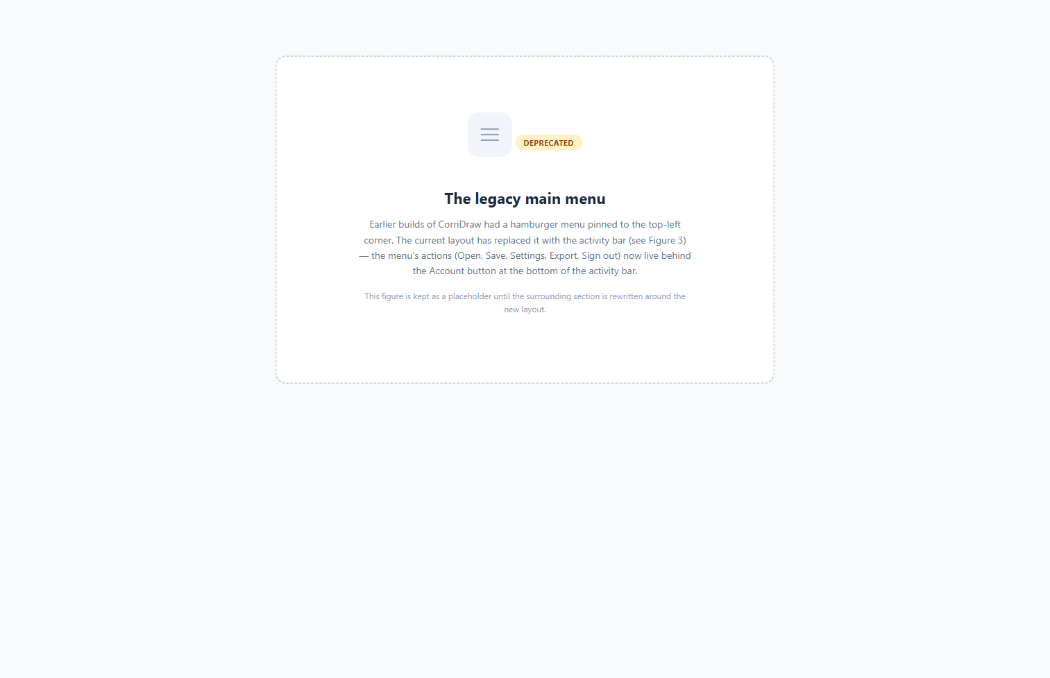
(Figure 5 below is a placeholder — the legacy hamburger menu it depicted no longer exists in this build.)
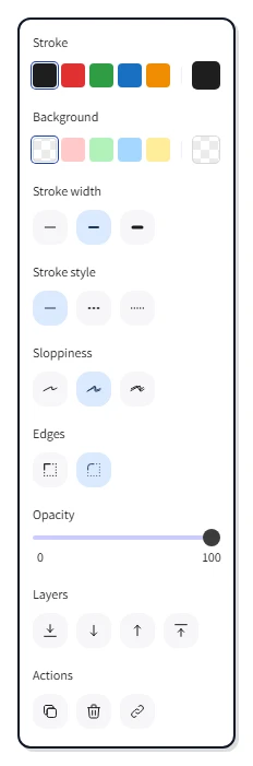
5. The right-side properties panel
The properties panel is hidden by default. The moment you click a shape (or marquee-drag a selection) it slides in along the right edge of the canvas. The panel shows only the properties that apply to your selection, with one row per setting — most are click-to-pick swatches and segmented controls, plus an opacity slider and a stack of action buttons at the bottom. From top to bottom:
- Stroke — color picker for the outline. Click a swatch, or click the eyedropper to sample a color from anywhere on the canvas.
- Background — fill color. Includes a "transparent" option.
- Fill — solid, hachure, zigzag, or cross-hatch.
- Stroke width — thin / bold / extra bold.
- Stroke style — solid, dashed, or dotted.
- Sloppiness — how hand-drawn the line looks: architect, artist, or cartoonist. The hallmark CorriDraw setting.
- Edges — sharp or round corners (rectangles only).
- Opacity — 0–100 slider; drag the handle or click the track.
- Layers — bring forward, send backward, bring to front, send to back.
- Actions — duplicate, delete, group, lock, link, copy styles. Each is a one-click icon button.
Multi-select changes the panel: properties shared by every selected element show normally; properties that differ across the selection show with a "—" placeholder until you click a common value to apply.
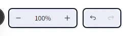
6. Zoom and history (bottom-left)
Bottom-left corner clusters the canvas-navigation and history controls. Each is a button you can click directly, with a keyboard shortcut for power users:
- Undo and Redo — the two curved-arrow buttons. Click to step backward
or forward through edits. Shortcut
Ctrl+Z/⌘+Zfor undo,Ctrl+Y/⌘+Shift+Zfor redo. - Zoom out and Zoom in — minus and plus buttons flanking the percentage
label. Shortcut
Ctrl+-andCtrl++. - The percentage label between them is a click target: clicking it resets
zoom to 100%. Shortcut
Ctrl+0. - The fit icon next to the cluster zooms to fit. Click it to fit all elements;
shortcuts
Shift+1(fit all),Shift+2(fit selection in viewport),Shift+3(zoom to selection).
The hand tool on the toolbar pairs with these controls — once you're zoomed in, click the
hand icon and drag to pan. Holding Space or middle-mouse button does the same
thing without leaving your current tool. On a touch device, two-finger drag pans and pinch
zooms.
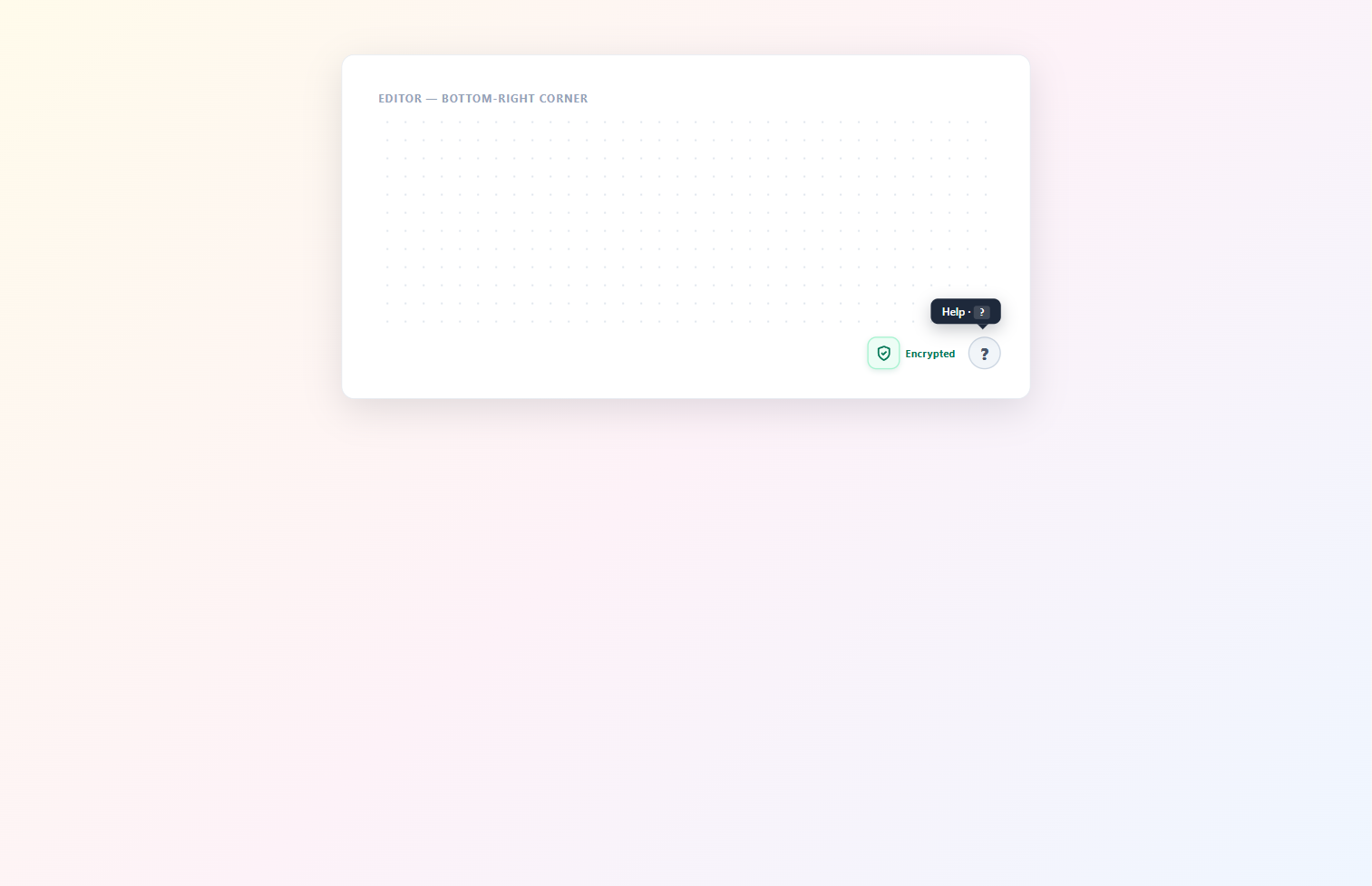
7. Status shield and help (bottom-right)
The bottom-right corner holds two small badges:
- The encrypted shield — a lock icon that confirms the diagram payload is end-to-end encrypted in collaborative sessions. Click it to see a tooltip describing the crypto guarantees.
- The help button — a circular question mark. Click it to open the
keyboard shortcuts cheat sheet (shortcut
?). The dialog has a search field at the top so you can hunt for a specific action without scrolling.
The infinite canvas
Everything else is the canvas itself: an unbounded 2D plane with a subtle dotted-paper
grid (toggle in the Canvas panel from the activity bar). Mouse-wheel scrolls
vertically; hold Shift while scrolling to pan horizontally;
Ctrl + wheel zooms. On a touch device, pinch to zoom and two-finger drag to
pan. The canvas has no edge — there's always more space in any direction.
Right-click anywhere on empty canvas to open the context menu — paste, paste as plaintext, paste charts, and a few other shortcuts that don't deserve their own toolbar slot. Right-click on a selected element to get a different menu: bring forward, group, copy styles, link, delete, and so on. On a tablet, long-press in the same spots to get the same menus.
![The right-click context menu on a selected rectangle. A vertical popover lists Cut (Ctrl+X), Copy (Ctrl+C), Paste (Ctrl+V), Wrap selection in frame, Copy to clipboard as PNG (Shift+Alt+C), Copy to clipboard as SVG, Copy styles (Ctrl+Alt+C), Paste styles (Ctrl+Alt+V), Add to library, Send backward (Ctrl+[), Bring forward (Ctrl+]), Send to back (Ctrl+Shift+[), Bring to front (Ctrl+Shift+]), Flip horizontal (Shift+H), Flip vertical (Shift+V), Add link (Ctrl+K), Copy link to object, Duplicate (Ctrl+D), Lock (Ctrl+Shift+L), and Delete in red at the bottom.](/screenshots/docs/editor-anatomy-9.webp)
Quick-reference shortcut card
Once you know where every icon lives, keyboard shortcuts are how you go fast. The single
most useful keystroke in the editor is ? — it opens the full keyboard cheat
sheet. The whole list is too long for this page; see
Keyboard shortcuts for the printable
reference. The eight shortcuts you'll use every session, though, are worth memorising:
V— selection toolR— rectangleA— arrowT— textCtrl+D/⌘+D— duplicate selectionCtrl+Z/⌘+Z— undoCtrl+/orCtrl+Shift+P— command palette (search every action)?— open the help dialog
With those eight keys and the seven UI regions above, you have the entire editor mapped. The next chapters take each shape, each style, and each collaboration mode one at a time.